Palette, Style, and Canvas: Making AI Scenes That Stick in a Memory Palace
Color and style to make words memorables
Published on
Part of the series: Illustrating Memory Palaces with AI
Following up on what AI can add to flashcard illustration and to the staging of memory-palace scenes, I develop the latter here. I share what I actually do to keep each scene visually distinct and how I combine scenes to make the most of each locus.
Why I Care About Visual Differentiation
In palace work, distinctiveness drives recall. If two neighboring scenes blur together, retrieval might slow down and errors creep in. I’ve found three levers that matter most:
- Palette (color family)
- Style (rendering mode, e.g., realistic vs. anime)
- Artist-level inspiration (a cohesive, recognizable “hand”)
Varying at least two of these across successive scenes is enough to prevent interference.
Color First: Serial Palettes
The Ideogram interface exposes palette controls that make quick variation trivial. Rotating palettes scene by scene endows each one with a different feel. When I rehearse, my mind reliably preserves color. If an image is painted in blue tones while the previous one is mostly yellow and the next orange-hued, that heightens its individuality and gives memory an extra foothold. Low effort, high gain.
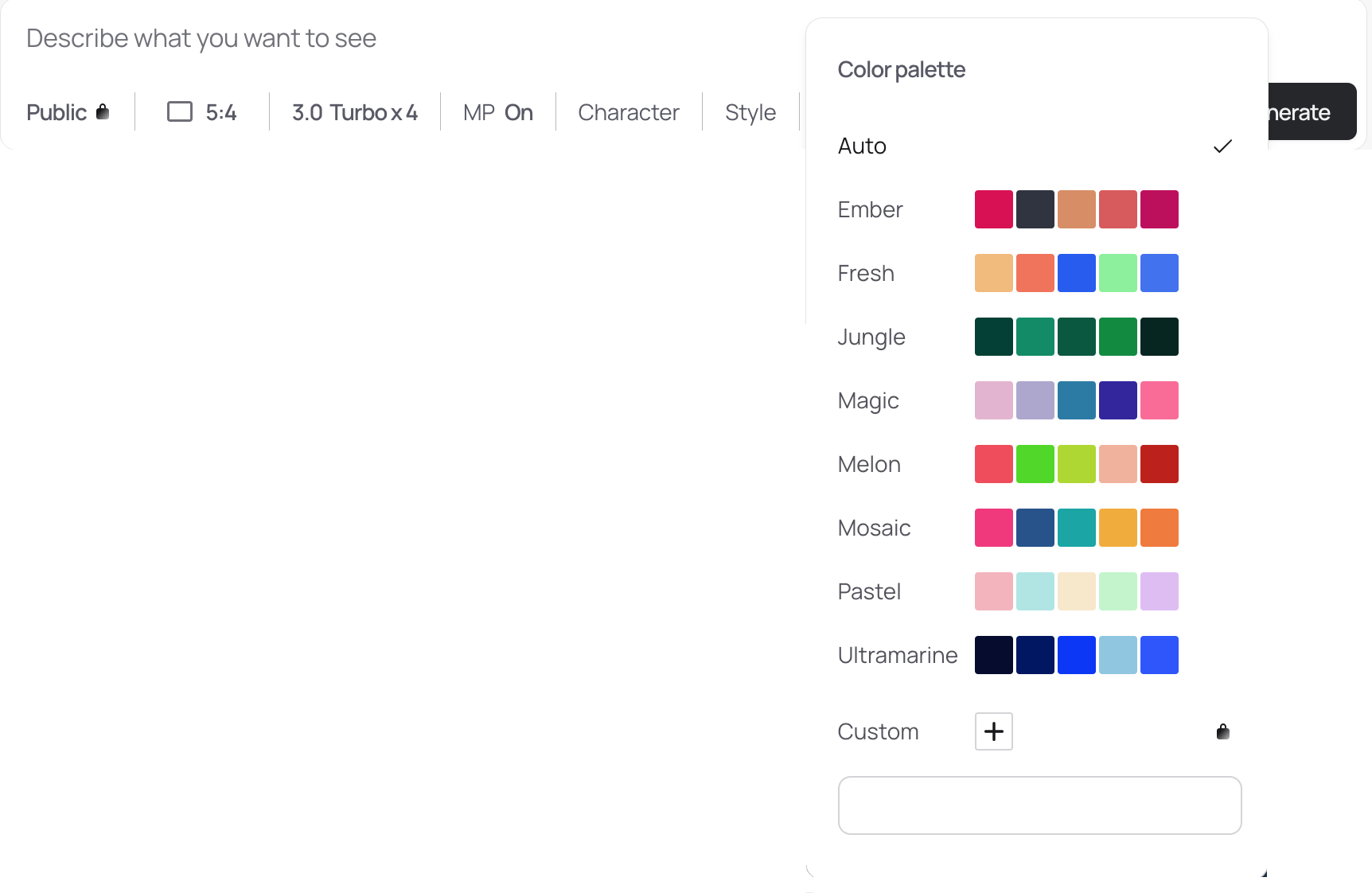
A Second Axis: Style Toggles
Since the spring, a Style parameter appeared in Ideogram. Alternating among a small set of styles compounds distinctiveness without extra cognitive load. It’s an easy way to give each image a signature.
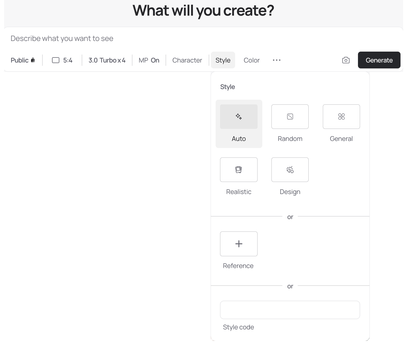
Menus vs. Prompts: The UI Converges
ChatGPT’s image UI now surfaces a similar style selector (several services do). Choosing a style pastes a few lines of rendering instructions in the user's chatbox. Historically we appended “realistic,” “analog film,” etc., to the prompt; the UI now injects those directives automatically, either as visibles appendices (ChatGPT) or hidden system prompts (Ideogram). I haven’t run a controlled A/B on checkbox vs. prompt-text for “realistic,” but in practice either route reliably sets a distinctive style.
Artist Inspiration: Where It Still Breaks
‘Style’ can be understood more broadly than in ChatGPT or Ideogram: you can request an image in the manner of a renowned artist whose signature touch you know well—Rembrandt, Vermeer, Rubens, and so on. In theory, combining palette + render style + artist inspiration should yield a third layer of specificity. In practice, my results have been mixed.
Let's consider the “crow cave with a chanter”, mentioned in my "How to Use Memory Palaces for Long-Term Vocabulary Retention" and "Using AI to Power-Charge Your Memory Palace". Here's what this scene looks like, retouched by OpenAI's models (gpt-image-1 called by ChatGPT 5 Thinking in the UI). I asked for a cartoon aesthetic, a blue palette, and Rembrandt as the guiding inspiration.
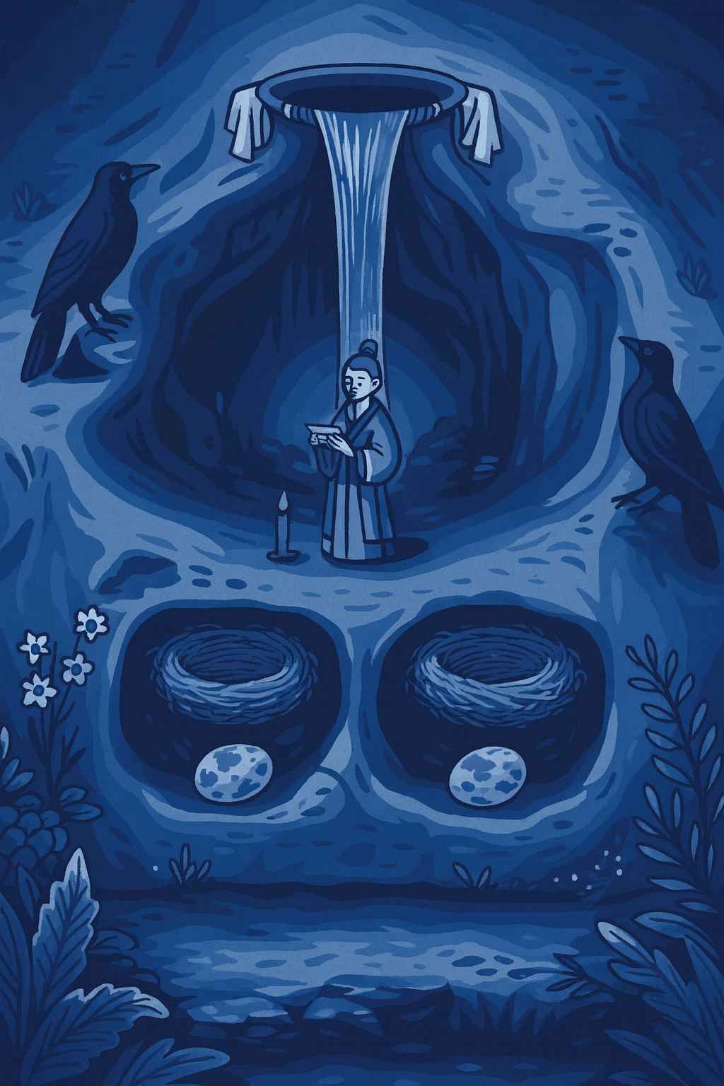
As you can see on the image above, Rembrandt has disappeared; the cartoon look dominates. Now, if I insist on Rembrandt, the cartoon aesthetic evaporates:
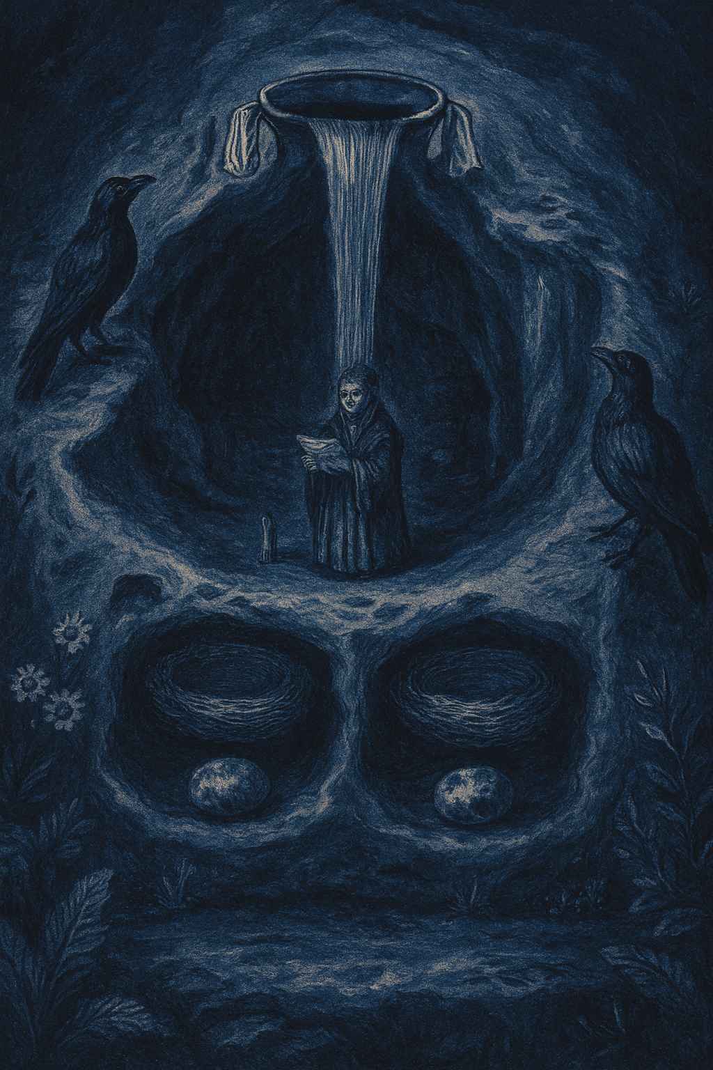
I can imagine a Rembrandt-esque cartoon (it’s a coherent target), but current models tend to collapse to one pole when I stack all three constraints. Two levers—palette + style—are stable today. The third—named artist—works selectively. This may improve with better prompting or newer versions; until then, keep your expectations pragmatic.
Working Principle
I now systematically vary palette and style (rendering mode or artistic inspiration) between successive scenes. This alone gives each tableau a crisp identity and prevents cross-scene bleed. You can either cycle a fixed set (e.g., four palettes × three styles) or vary endlessly. Doubtless both strategies work equally well.
What to Do With the Images
Ideogram’s infinite canvas lets me lay scenes side by side for panoramic review, without juggling files. But I’m reluctant to store everything on a platform that may change without notice. Specific pain points for my use:
- No full-canvas export (as far as I can tell).
- If I drop the subscription, local uploads are blocked, which breaks mixed-source workflows.
Local-First Instead: Obsidian Canvases
I already used Obsidian to manage notes; reling on it for my canvas (i.e. a white board of infinite dimensions that can accommodate any number of images) was a natural step. I line up creations five by five and sweep them frequently.
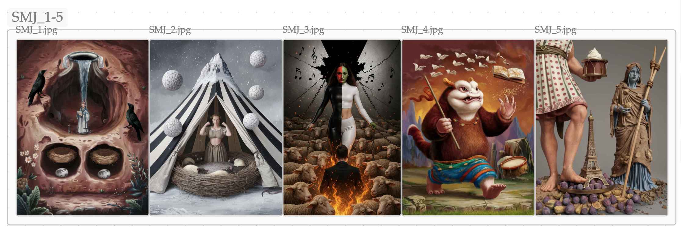
Two quick notes from that strip:
- It dates from my first Ideogram steps, before I exploited palette and style systematically. Even so, the exquisite weirdness of these scenes was distinctive enough that I could not confuse them.
- In the second image, the tent fabric shows black-white stripes; in the fifth, the tunic is dotted. These are encoding refinements I hadn’t mentioned: by convention, any emblem symbolizing a word whose first syllable has a long vowel gets stripes; any with a long second syllable gets dots. Sanskrit marks vowel length; this visual trick reduces errors.
Many languages have phonetic alternations beginners confuse. A disciplined marking convention like this increases recall precision. In parallel, I try to understand the etymology behind orthography and phonology. If I remember that melancholia hides Greek χολή (kholé, bile), then the chi (aspiration) naturally surfaces as “ch” in the Latin script—a cleaner route than rote.
Shortcuts are tempting—ignoring vowel length in Sanskrit, or hand-waving Tibetan spelling (often far from modern pronunciation in Central Tibet—think of the situation in French, where eau, water, is pronounced /o/). Over time, that erodes recognition and inflates homophone confusion. I’d rather pay the small cost up front.
Why Obsidian Works for This
An Obsidian canvas is a local .canvas file. I can open it in a text editor, batch-edit paths after a folder move, and script conversions if I ever migrate. Transparency and speed (no page loads) matter.
Here’s a snippet from the canvas behind the strip above:
{
  "nodes":[
    {"id":"c4237a39a40654df","type":"group","x":4755,"y":-170,"width":6040,"height":440,"label":"flashcards_md/canvases/sanskrit_scenes/SMJ_11-15"},
    {"id":"b45f2dd4d99d47c1","type":"group","x":1415,"y":-171,"width":3340,"height":441,"label":"flashcards_md/canvases/sanskrit_scenes/SMJ_6-10"},
    {"id":"70ada252ad2e5fca","type":"group","x":-160,"y":-240,"width":1505,"height":441,"label":"SMJ_1-5"},
    {"id":"32fc6c9daf5b35f5","type":"file","file":"flashcards_md/canvases/sanskrit_scenes/SMJ_1.jpg","x":-140,"y":-219,"width":300,"height":400},
    {"id":"7ee04b6c1e549001","type":"file","file":"flashcards_md/canvases/sanskrit_scenes/SMJ_2.jpg","x":160,"y":-219,"width":300,"height":400},
    {"id":"f0f5856d11d5038a","type":"file","file":"flashcards_md/canvases/sanskrit_scenes/SMJ_3.jpg","x":460,"y":-219,"width":267,"height":400},
Local-first gives me: instant navigation (jump between groups thanks to Obsidian's keyboard shortcuts), durability, and low-friction portability if I ever change tools.
How I Study with the Canvas
- Inspect one scene at a time.
- Place it somewhere definite in the palace (e.g., the back gate of the wallaby enclosure).
- Decode the emblems; check the vocabulary list if I hesitate.
- After the initial pass, rehearse mentally only. The images served their purpose: they stabilized the scene; the emblems now carry enough cues to self-correct.
What’s Next
In the next piece I’ll show how I bind each visualization to its locus more tightly.


